


Data visualization in Excel is the process of representing data in graphical formats such as charts, graphs, and maps to help users interpret and analyze information more effectively. Excel offers a variety of built-in tools for creating compelling visualizations, including bar charts, line graphs, pie charts, scatter plots, and more. These visual tools allow users to easily identify trends, patterns, and outliers in large datasets, which would be difficult to understand in raw number format.
By visualizing data, users can gain deeper insights into business performance, sales trends, financial data, and other key metrics. Excel’s features, such as PivotTables, PivotCharts, and Conditional Formatting, allow for dynamic and interactive visualizations that can be customized to meet specific needs. For example, PivotCharts enables quick summary and analysis of large datasets, while Conditional Formatting highlights key data points to focus on critical information.
Using color, labels, and clean formatting in Excel charts ensures that visualizations are clear and easy to understand. Whether you're preparing a report or making data-driven decisions, mastering data visualization in Excel is essential for presenting complex information in a more digestible and impactful way.
Data visualization is important because it helps to transform complex data into a clear, visual format, making it easier to understand and interpret. With large datasets becoming increasingly common, it’s crucial to quickly identify trends, patterns, and outliers that might otherwise go unnoticed in raw data. By using charts, graphs, and other visual tools, data visualization simplifies the process of data analysis and allows for faster decision-making.
Effective visualizations also make it easier to communicate insights to others, whether it's within a team, to stakeholders, or during presentations. People process visual information faster than text or numbers, so well-designed visuals can convey important information more efficiently.
Moreover, data visualization enhances the ability to identify relationships between different variables and can uncover hidden insights. It aids in forecasting, spotting potential problems, and evaluating performance across different business areas. In short, data visualization is a powerful tool that not only facilitates a better understanding of data but also drives more informed decisions, leading to improved strategic planning and business outcomes.
Getting started with data visualization in Excel is a straightforward process, but it requires a clear understanding of your data and the tools available. Here's a step-by-step guide to help you begin:
1. Prepare Your Data: Before creating any visualizations, ensure your data is clean and well-organized. Structure your data in a tabular format, with headers for each column and data entries below. This will make it easier to create charts and ensure Excel can interpret the data correctly.
2. Choose the Right Type of Chart: Excel offers a wide range of chart types, such as bar charts, line graphs, pie charts, and scatter plots. Select a chart type based on the type of data you have and the insights you want to convey. For example:
3. Create a Chart: Highlight the data you want to visualize, then go to the Insert tab in Excel's ribbon. Choose the appropriate chart type, and Excel will automatically generate a chart for you. You can further customize it by adjusting titles, labels, and colors.
4. Refine the Visualization: Use Excel’s chart tools to customize your visualization. You can add data labels, adjust axis scales, change colors, and add legends to make your chart clearer. You can also format the chart for better presentation by using predefined styles or manually adjusting individual elements.
5. Explore Advanced Features: As you become more comfortable, you can explore advanced tools like PivotCharts (for summarizing large datasets) or Conditional Formatting (for highlighting key data points). These features can help you create dynamic, interactive visualizations that adjust based on your data.
By following these steps, you can effectively use Excel to turn raw data into meaningful visual insights, enabling you to make better-informed decisions.

Excel offers a wide range of chart types, each serving a specific purpose. Choosing the right chart for your data is crucial to communicating insights effectively. Here’s an overview of the most common types of charts in Excel and when to use them:
Bar and column charts are some of the most commonly used visual tools in Excel, especially when comparing discrete data points. Bar charts display data horizontally, while column charts display data vertically. Both are effective for comparing categories or showing trends, and the choice between bar and column charts typically depends on the length of the category labels and the number of categories.
When to Use:
Line charts are used to show data trends over time. By connecting data points with a continuous line, line charts make it easy to visualize how values change, increase, or decrease over a specific period. Line charts can handle multiple data series and are often used when it's important to observe trends, whether the data is daily, monthly, or yearly.
When to Use: Use line charts when tracking continuous data points over time, such as monitoring stock prices, website traffic, or monthly revenue. They are perfect for showing the relationship between two or more variables over a given period.
Pie charts are used to show the proportion of parts to a whole. The chart divides a circle into slices, with each slice representing a category’s contribution to the total. This type of chart is effective when you want to illustrate the relative sizes or percentages of components in a dataset, making it ideal for depicting distribution.
When to Use: Pie charts should be used when you need to show the percentage distribution of a single series of data. For example, showing how different product categories contribute to overall sales or visualizing a survey response breakdown (e.g., Yes vs. No).
Scatter plots are used to display the relationship between two continuous variables. Each point on the plot represents a pair of values, making it a useful tool for identifying correlations, clusters, or patterns within data. Scatter plots help reveal how one variable may affect another.
When to Use: Scatter plots are ideal for analyzing correlations or relationships between two variables. For example, use a scatter plot to analyze the relationship between advertising spend and sales revenue or the correlation between age and income.
Area charts are similar to line charts, but they fill the area beneath the line with color, making them effective for emphasizing the volume of data over time. They help illustrate cumulative totals and are useful for showing the relative proportions of categories in a time series.
When to Use: Area charts are perfect when you want to show how individual categories contribute to a total over time. For example, displaying the cumulative sales across different regions or the growth of revenue over several years.
Doughnut charts are similar to pie charts but have a central hole, allowing for multiple data series to be represented within the same chart. The donut shape allows for easier visualization of multiple parts to a whole and works well for displaying hierarchical data or more complex datasets.
When to Use: Use doughnut charts when you want to show parts of a whole, especially when dealing with multiple data series. For instance, comparing the proportion of sales from different product lines and regions simultaneously.
Histograms are used to show the frequency distribution of a dataset. By grouping data into intervals (bins), histograms provide insights into how data is distributed across various ranges. This type of chart is particularly useful for understanding the spread and concentration of data points.
When to Use: Use histograms when you need to analyze the distribution of data, such as test scores, age ranges, or income levels. They are particularly useful for understanding the frequency and spread of continuous variables.
Combo charts combine different chart types (e.g., bar and line charts) in a single visualization to display multiple data series with varying data types. This is helpful when comparing data that has different units or scales, making it easier to see relationships between datasets.
When to Use: Combo charts are ideal when you need to compare multiple data series that have different types or scales. For example, comparing actual sales with projected sales or displaying revenue alongside profit margins, where one series is better represented by bars and the other by a line.

Visualizing data in Excel is a straightforward process, but to get the best results, it requires some preparation and a clear understanding of the data. Here are the key steps to follow for creating effective data visualizations in Excel:
Data preparation is crucial before you begin creating visualizations. Ensure your data is organized in a tabular format with clear column headers, and each row represents a separate data point.
Clean any inconsistencies, missing values, or outliers in your dataset, as these can distort the visual representation of your data. Proper organization and cleaning make it easier for Excel to interpret and visualize the data accurately.
After preparing your data, highlight the range of data you wish to visualize. This includes both the headers and the actual data. Excel uses this selection to create the chart, so it's essential to select the appropriate data range.
If your data is in a table, you can click anywhere within it, and Excel will automatically recognize and adjust the range. Ensuring that you select the correct data ensures the chart accurately represents the data you want to display.
Once you’ve selected the data, you need to choose the right type of chart. Excel offers various chart options, such as column charts, bar charts, line charts, pie charts, and scatter plots. Each type is suitable for different kinds of data and analyses.
For instance, use line charts for trends over time, bar charts for comparisons, and pie charts for parts of a whole. Choosing the right chart type is essential for effectively communicating the insights from your data.
After selecting the chart type, Excel will automatically generate a chart based on your data range. The chart will be displayed on your worksheet, and you can see the visual representation of your data immediately.
Excel automatically chooses a default layout, but you can modify it further. If the chart doesn’t seem to fit the data or lacks clarity, it’s easy to change the chart type or make adjustments.
Customization is key to making the chart clearer and more appealing. Excel allows you to add or modify titles, adjust the axes, change colors, add data labels, and adjust the layout.
Customizing your chart helps highlight the most important information and ensures it’s easy for your audience to interpret. This step allows you to make the chart more informative and visually aligned with the data it represents.
Once your chart is created and customized, take time to analyze the visual representation of the data. Ensure that the chart is clear, easy to understand, and accurately reflects the trends and patterns you want to communicate.
The goal is to make sure the key insights stand out and the chart tells a clear story without any confusion or clutter. Check if the chart supports your analysis and if it’s effectively conveying the message to the intended audience.
After reviewing the chart, refine and fine-tune it for a polished presentation. Adjust the layout, colors, and design to ensure the chart is both professional and visually appealing.
You can change the chart elements, reposition the legend, or adjust the font sizes for better clarity. This step ensures your chart is not only functional but also aesthetically pleasing and suitable for sharing with stakeholders or presenting in reports.
Once you’re satisfied with your chart, save your work. You can share the Excel workbook directly, or you may choose to copy and paste the chart into other applications like PowerPoint or Word for reports and presentations. If the chart needs to be interactive, such as in a dynamic dashboard, Excel’s PivotCharts and slicers allow for deeper exploration of the data.
Make sure to save the file in a format that’s easily shareable with others, like .xlsx, PDF, or even a PNG image of the chart. By following these steps, you can ensure that your data visualizations in Excel are well-constructed, easy to understand, and ready for presentation or analysis.
Excel provides a variety of powerful tools for data visualization, each designed to help you transform raw data into clear, insightful graphics. These tools range from simple charts to more advanced features that allow for interactive and dynamic visualizations. Here's a breakdown of some of the key data visualization tools available in Excel:
Charts are the core tool for data visualization in Excel, offering a wide variety of types to suit different data presentation needs.
These include:
Each chart type can be customized to suit your needs, such as adjusting colors, adding titles, or changing data labels for clarity.
PivotTables are one of Excel's most powerful tools for summarizing and analyzing large datasets. They allow you to quickly group, filter, and aggregate data without modifying the original dataset. Once you’ve created a PivotTable, you can easily convert it into a PivotChart, which provides a graphical representation of the summarized data.
Conditional Formatting in Excel allows you to highlight important data points, trends, or outliers based on certain criteria. This feature changes the formatting (such as cell color, font color, or icon sets) based on the value of the data.
Sparklines are small, cell-sized charts embedded within a spreadsheet that provide a compact view of trends or patterns in a dataset. They are often used to visualize trends in a series of values without taking up too much space.
Although Power BI is a separate tool, it can be integrated with Excel to provide advanced data visualizations and interactive dashboards. Power BI allows you to create interactive reports, share dashboards, and analyze data across multiple sources with advanced visuals and features that go beyond the built-in options in Excel.
3D Maps in Excel allows you to create interactive visualizations of geographical or time-based data. It uses a three-dimensional mapping tool to plot data on a map, which is particularly useful for visualizing geographic trends, such as sales by region or data over time.
Excel's Data Model feature allows users to work with multiple tables of data and create relationships between them without needing to combine the data manually. Once tables are linked through relationships, you can create PivotTables, PivotCharts, and other visualizations that pull from multiple tables.
Excel also allows users to create charts that automatically update as the data changes by using dynamic ranges with the help of named ranges or Excel's Table feature. This ensures that the charts are always up-to-date without having to adjust the data range manually.

Customizing charts in Excel is essential for improving clarity, aesthetics, and the overall effectiveness of your data visualization. Excel offers a variety of options to modify charts, ensuring that your message is communicated clearly and that your charts are tailored to the audience. Here's how to customize charts in Excel for better visualization:
Customizing chart titles and axis labels is crucial for providing context to your audience. The chart title should clearly describe what the chart is depicting, while axis labels should specify the variables on each axis.
Adding these elements helps make the chart more informative, ensuring that viewers can immediately understand the data being presented. You can easily edit these titles by selecting them within the chart and typing the desired text.
Changing the color scheme of your chart helps improve its visual appeal and can highlight key data points. You can select different colors for different data series or customize individual elements to draw attention to particular trends or outliers.
Color customization is especially important for presentations or reports where clarity and visual impact are essential. Using contrasting colors can make the chart more readable and visually striking, ensuring that important data is easily identified.
Adding data labels to your chart helps provide exact values for each data point, enhancing the chart’s clarity. This is particularly useful when precise information is necessary, such as showing the exact sales figures or percentages.
Customizing data labels also allows you to display values with specific formats, such as currency symbols or percentages, making the chart more relevant and easier to understand at a glance.
Formatting the chart’s axes is an important step to ensure the data is presented accurately. By adjusting the axis scales, intervals, or ranges, you can control how the data is displayed, making it more meaningful and easier to interpret.
For example, setting a logarithmic scale might be helpful for data that spans a wide range. Proper axis formatting ensures that the chart does not distort the data, giving a more accurate representation of trends or relationships.
Gridlines and trendlines help improve the chart’s readability and make it easier to identify patterns. Gridlines provide a reference for aligning data points with the chart’s scale, making it easier for viewers to interpret values.
Trendlines, on the other hand, reveal patterns or trends within the data, such as growth or decline over time. These elements are especially useful for emphasizing key insights and guiding the viewer’s attention to important trends in the data.
The legend in a chart explains what each data series represents, so customizing its appearance and placement can improve chart clarity. By adjusting the position of the legend, you can prevent it from overlapping with the chart or distracting from key data points.
Modifying the font size, color, or style of the legend can also help improve its readability and ensure that it doesn’t detract from the overall presentation of the chart.
Chart styles and themes provide predefined formatting that can instantly enhance the visual appeal of your chart. Excel offers a variety of built-in styles and themes, which adjust the chart's colors, fonts, and design elements.
These styles help you achieve a professional and consistent look, especially when creating multiple charts for reports or presentations. By applying these styles, you can ensure your charts are not only visually appealing but also uniform across your document or presentation.
Adjusting the size and layout of your chart ensures that it fits properly within the context of your report or presentation. A well-sized chart improves its visibility and prevents it from appearing too crowded or overly spaced. You can resize the chart to fit a specific area or adjust its layout to ensure the most important information is front and center.
A balanced chart layout also makes it easier for the viewer to digest the data and understand the trends being presented. These customizations collectively help improve the visual appeal, readability, and effectiveness of your charts, making them clearer and more impactful for your audience.

Advanced Excel visualization features offer powerful tools to create dynamic and interactive charts, handle complex datasets, and generate deeper insights from your data. These features go beyond basic charting options and are ideal for users who need more sophisticated visualizations. Here’s an overview of some of the advanced Excel visualization features:
Power Pivot in Excel allows users to create complex data models by combining data from multiple sources. It enables advanced calculations using DAX (Data Analysis Expressions) and creates relationships between different tables of data.
With Power Pivot, you can handle large datasets efficiently, perform in-depth analysis, and generate powerful insights without manually merging data. This feature is especially useful for users working with multi-dimensional data and requiring advanced reporting capabilities.
PivotCharts are dynamic charts that are linked to PivotTables, offering an interactive way to visualize and analyze complex datasets. These charts automatically update as changes are made in the Pivot Table, allowing users to explore different views of the data by adjusting filters or grouping. PivotCharts are ideal for presenting large, dynamic datasets in a visual format, enabling quick insights and facilitating data-driven decision-making.
3D Maps, or Power Map, is a tool in Excel that allows users to plot geographic or temporal data on a map in a 3D visualization. This feature is particularly useful for displaying trends or patterns related to geographical locations, such as sales by region or customer distribution.
It provides an engaging and interactive way to visualize location-based data, helping users uncover spatial patterns that might not be immediately apparent in a table or standard chart.
Conditional formatting with icons and data bars is a feature that allows users to highlight specific trends or values within a dataset visually. By applying icons or data bars to cells, Excel users can easily identify the highest or lowest values, trends, or outliers.
This tool is useful for quickly spotting patterns without having to create a chart. Conditional formatting improves the readability of data by adding visual cues, helping users understand and interpret the information more easily.
Slicers are interactive filters that allow users to filter data in PivotTables, PivotCharts, and Excel tables with a simple click. They provide a visual interface for selecting specific data segments, enabling users to focus on the most relevant information quickly.
Slicers make it easy to filter and manipulate data without manually adjusting settings. They are particularly valuable in dashboards or reports where users need to explore different data sets dynamically.
Dynamic charts in Excel are charts that automatically update as new data is added or changed in the source. By converting data into tables or using named ranges, Excel charts will automatically expand to include new data points.
This feature is especially useful when dealing with frequently changing data, as it ensures that the charts always reflect the most current information without needing to adjust the chart’s data range manually.
Heat maps are a form of data visualization where cells are colored according to their values, allowing users to identify trends, patterns, or outliers quickly. Excel's conditional formatting feature can be used to create heat maps by applying color scales to the data range.
This visualization method is highly effective for comparing large sets of values, as the varying colors provide a clear and immediate understanding of the data distribution.
Sparklines are small, in-cell charts that provide a compact view of trends or patterns within a dataset. These mini-charts can be added directly to individual cells next to the data they represent, making them a powerful tool for showing trends over time, such as sales growth or stock price movements. Sparklines are ideal for dashboards or reports where space is limited, but you still need to convey trends quickly and efficiently.
Excel’s What-If Analysis tools, including Goal Seek, Scenario Manager, and Data Tables, allow users to explore how changes in one or more variables affect the outcome of a model.
These tools are used for forecasting, budgeting, or testing different scenarios by altering the inputs and observing the resulting changes in outputs. What-if analysis is useful for decision-making, as it helps users assess potential outcomes under different assumptions or conditions.
Power BI is a business analytics service that can be integrated with Excel to create more advanced and interactive visualizations. By exporting data from Excel into Power BI, users can design highly dynamic dashboards and reports that provide deeper insights and can be shared across teams.
Power BI enhances Excel’s capabilities by offering additional features like advanced visualizations, drill-downs, and interactive controls that make data analysis even more powerful and user-friendly.
Effective data visualization is crucial for conveying insights and making data understandable. To create compelling, clear, and impactful visualizations, here are some tips and best practices:
Understanding your audience is key to creating relevant and effective visualizations. Different stakeholders may require different levels of detail, complexity, and design. For instance, executives might prefer high-level insights with clear trends, while analysts may need a more detailed breakdown of the data. Tailor the design, color schemes, and type of chart to meet the needs of the viewer, ensuring the message is accessible and easily understood.
Choosing the appropriate chart type is vital for effective communication. Different chart types highlight different aspects of the data.
For example:
Overcomplicating your visualizations with too much data or unnecessary elements can confuse the audience. Keep the chart or graph simple and focused on the key message. Avoid cluttering the visualization with too many categories, colors, or elements that can distract from the main point. Use white space to separate elements and make the chart easy to read. If the data is too complex, consider breaking it down into smaller visualizations.
Color can be a powerful tool for emphasizing key points, creating a visual hierarchy, or highlighting trends. However, it’s important to use color consistently and avoid overwhelming the viewer with too many colors. Stick to a limited color palette, and ensure there is enough contrast between different elements for clarity. If using color for differentiation, make sure the colors are distinguishable, even for colorblind users, and ensure that they align with any brand guidelines if applicable.
Clear labeling is essential to ensure your audience understands the data. Add titles, axis labels, and data labels where necessary, and ensure they are readable. Avoid using jargon or abbreviations that could confuse the viewer. Use straightforward language and keep the text concise. If a chart has multiple data series or categories, use a legend to explain what each element represents clearly.
A great data visualization doesn't just present data; it tells a story. Try to guide your audience through the insights you want them to grasp. Use design techniques like emphasizing key data points with bold colors or adjusting chart axes to focus on important details. Consider how the data flows and how the audience will interpret the information to tell a narrative that leads to a clear takeaway.
Consistency in your visualizations is key to clarity and professionalism. This applies to font choices, color schemes, axis labeling, and chart styles. Ensure that similar data points are represented consistently across multiple charts or reports to avoid confusion. Consistency helps users better understand the relationships between different visualizations and interpret the data accurately.
While 3D charts may look visually striking, they can distort the data and make it harder to read. The perspective in 3D charts can sometimes skew the perception of the actual values, making it challenging to compare data accurately. It's usually best to stick with 2D charts, which are easier to read and interpret, especially when presenting numerical data.
Always ensure the data you’re visualizing is accurate and reliable. Misleading visualizations can have a negative impact on decision-making. Double-check your data, use proper scales, and avoid manipulating visualizations in ways that can misrepresent the truth. Transparency about the data source and methodology is also important to build trust with your audience.
Interactive features, like slicers, filters, and tooltips, can make your data visualizations more engaging and provide deeper insights. These tools allow users to interact with the data, focus on specific segments, and explore different perspectives of the data on their own. Interactive visualizations are especially useful in dashboards or reports where users may need to analyze the data in more detail.
Before finalizing a data visualization, test it with different users to see if they can easily understand the insights you're trying to communicate. Gather feedback on readability, clarity, and effectiveness. Based on the feedback, make necessary adjustments to improve the design, labels, or overall presentation. This iterative process ensures the final visualization serves its intended purpose effectively.
Accessibility is a crucial aspect of effective data visualization. Ensure that your visualizations are accessible to all users, including those with visual impairments. Use high-contrast colors and readable fonts, and avoid overloading the visualization with too much information. Tools like screen readers can also benefit from descriptive alt text for charts and images. Prioritize clarity and usability for all potential viewers.
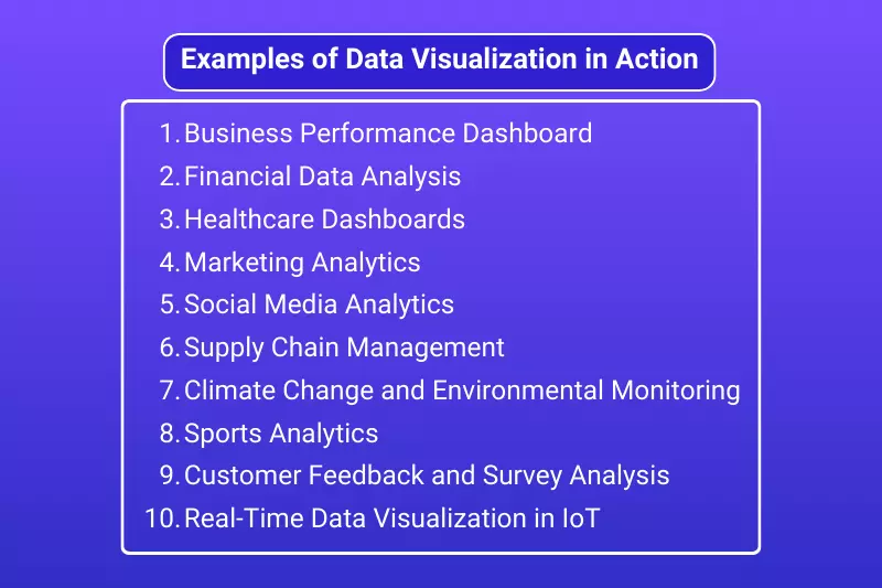
Data visualizations help present complex data in an easily digestible format. Here are a few examples of how data visualization is used in different industries to enhance decision-making and convey insights effectively:
A business performance dashboard is a classic example of data visualization in action. It consolidates key metrics—such as sales figures, customer satisfaction scores, and inventory levels—into a single view. Through interactive charts, graphs, and KPIs (Key Performance Indicators), decision-makers can quickly assess the health of the business, track performance against targets, and identify areas for improvement. Dashboards often use a combination of line charts, bar graphs, and pie charts to show trends, distributions, and comparisons.
Financial analysts often use visualizations like line charts, candlestick charts, and area graphs to track the performance of stocks, bonds, and market trends. These visualizations help reveal market behavior over time, showing things like volatility, peaks, and dips. In addition, pie charts are often used to display the proportion of assets in a portfolio, while bar charts help compare quarterly revenue or expenses.
In the healthcare industry, data visualizations are used to track patient health metrics, manage hospital operations, and assess public health trends. Visualizations like heat maps, line graphs, and bar charts allow healthcare professionals to see real-time data such as patient admissions, disease outbreaks, and treatment outcomes.
In marketing, data visualizations help track key metrics such as website traffic, customer engagement, and campaign effectiveness. Line charts and bar graphs can display trends over time, while pie charts show the breakdown of customer demographics or conversion rates. Visualizing customer segmentation through scatter plots or heat maps allows marketing teams to understand customer behavior and optimize targeting.
Social media platforms generate massive amounts of data, which can be overwhelming without proper visualization. Companies use charts and graphs to analyze engagement metrics, like likes, shares, comments, and follower growth. Sentiment analysis charts and word clouds can visualize the general tone of conversations or mentions related to a brand.
Data visualization is integral in supply chain management to track inventory, monitor shipments, and optimize logistics. Heat maps can identify areas of high demand or low supply, while flow diagrams and Gantt charts help visualize the stages of production and delivery.
Environmental scientists and researchers use data visualization to track and communicate climate change data, such as rising temperatures, carbon emissions, or changes in sea levels. Tools like scatter plots, bar charts, and interactive maps help present complex environmental data to the public or policymakers in an understandable way.
In sports, data visualization plays a critical role in analyzing player performance, team strategies, and game outcomes. Advanced visualizations like shot charts, heat maps, and player tracking systems provide coaches, analysts, and fans with detailed insights into a team’s performance, such as areas of the field where a player is most successful.
Surveys and customer feedback often generate large amounts of qualitative and quantitative data. Visualization tools like bar charts, word clouds, and sentiment analysis charts are used to analyze customer opinions, satisfaction, and preferences, providing businesses with actionable insights for product development or customer service improvements.
With the rise of the Internet of Things (IoT), real-time data visualization is increasingly important. IoT devices, such as smart thermostats, wearable fitness trackers, and manufacturing sensors, generate large amounts of real-time data. Visualizations like real-time dashboards, gauges, and trend graphs allow users to monitor and act upon this data quickly.
Data visualization in Excel is a powerful tool that enables users to transform raw data into meaningful insights. Whether you're analyzing business performance, tracking trends, or making data-driven decisions, Excel provides a wide range of charting and visualization tools that can simplify complex datasets. By leveraging features like PivotTables, Power Pivot, 3D Maps, and dynamic charts, users can present information clearly and compellingly.
Effective data visualization goes beyond just creating charts—it’s about understanding your audience, choosing the right visualization types, and ensuring clarity and simplicity in your design. Customizing charts, using color wisely, and telling a story with the data are all essential elements for making your visualizations more impactful.
Copy and paste below code to page Head section
Data visualization in Excel involves using charts, graphs, and other visual tools to represent data in a graphical format. It helps make complex data easier to understand and analyze, enabling better decision-making by presenting trends, comparisons, and patterns in a visually compelling way.
PivotCharts are charts linked to PivotTables that allow you to visualize and explore data dynamically. They are particularly useful for large datasets, as they update automatically when you adjust the data in the Pivot Table, providing an interactive way to analyze complex data.
Yes, Excel can handle large datasets, especially when you use tools like Power Pivot to work with millions of rows of data without compromising performance. It allows for more advanced data modeling, aggregation, and analysis, making it a great tool for working with big data.
Power BI is a business analytics service that allows you to create interactive reports and dashboards. It integrates with Excel by allowing you to import Excel data and build more advanced visualizations, providing deeper insights and interactivity for business intelligence needs.
Conditional formatting in Excel allows you to apply different formats (colors, icons, or data bars) based on cell values. This helps you quickly spot trends, outliers, or significant data points. For example, you can highlight high-performing sales figures with green and low-performing ones with red.
While basic data visualization in Excel is user-friendly and accessible to beginners, advanced Excel skills like using Power Pivot, creating dynamic charts, and working with large datasets can significantly improve the quality and depth of your visualizations. However, even beginners can create effective visualizations using Excel’s built-in charting tools and customization options.


